
Padre Azul
We believe: the best brands aren’t invented. They’re uncovered.
Together with PADRE AZUL, we revealed a philosophy built on their believes in eternal friendship, love and unforgettable moments.

From bottle cap to brand icon.
We transformed a simple bottle cap into a symbol people instantly recognize—and love.

Finding the emotional territory.
Once the brand had a face, it needed a soul.
We've distilled all the content, stories, and experiences of the brand—and the people behind it—into a single archetype:
We've distilled all the content, stories, and experiences of the brand—and the people behind it—into a single archetype:
Magic.

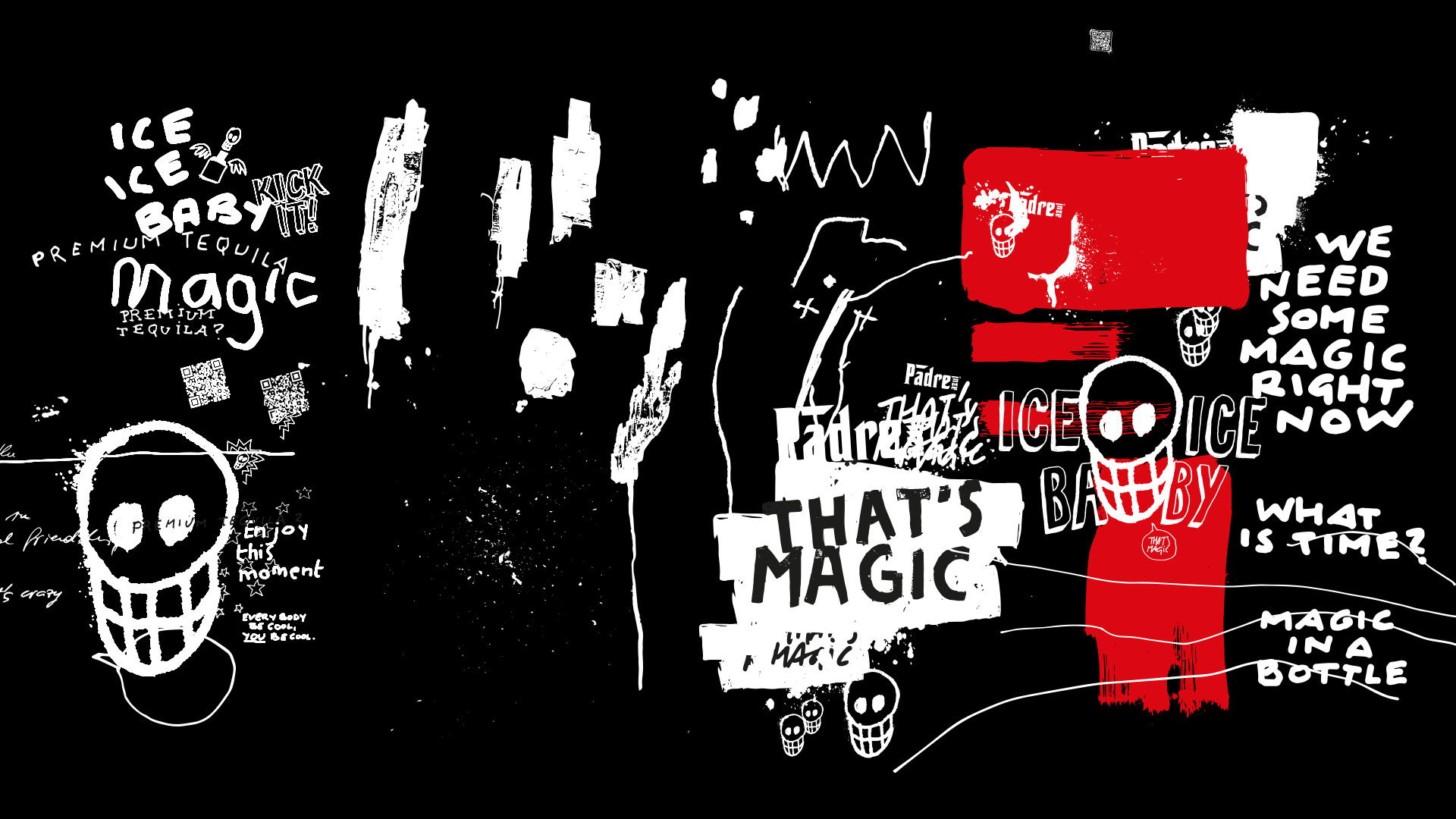
Based on the vivid Street Art of Mexico, we created a handcrafted visual language using hand-drawn graphics, real photography and expressive collages.
Human. Raw. Unmistakably PADRE AZUL.


From graphics to spaces.
A brand only becomes real when people can experience it.
Our visual language defines clubs, hotels, trade fairs and live events.

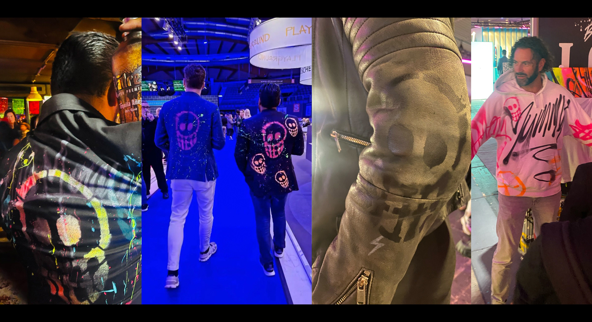
Live, not staged.
Artists brought the brand to life by painting walls, installations and even clothing live—turning every event into a unique PADRE experience.

Some love them, others hate them, but no one can ignore them:
the Padre Azul bottles created by various artists and designers.
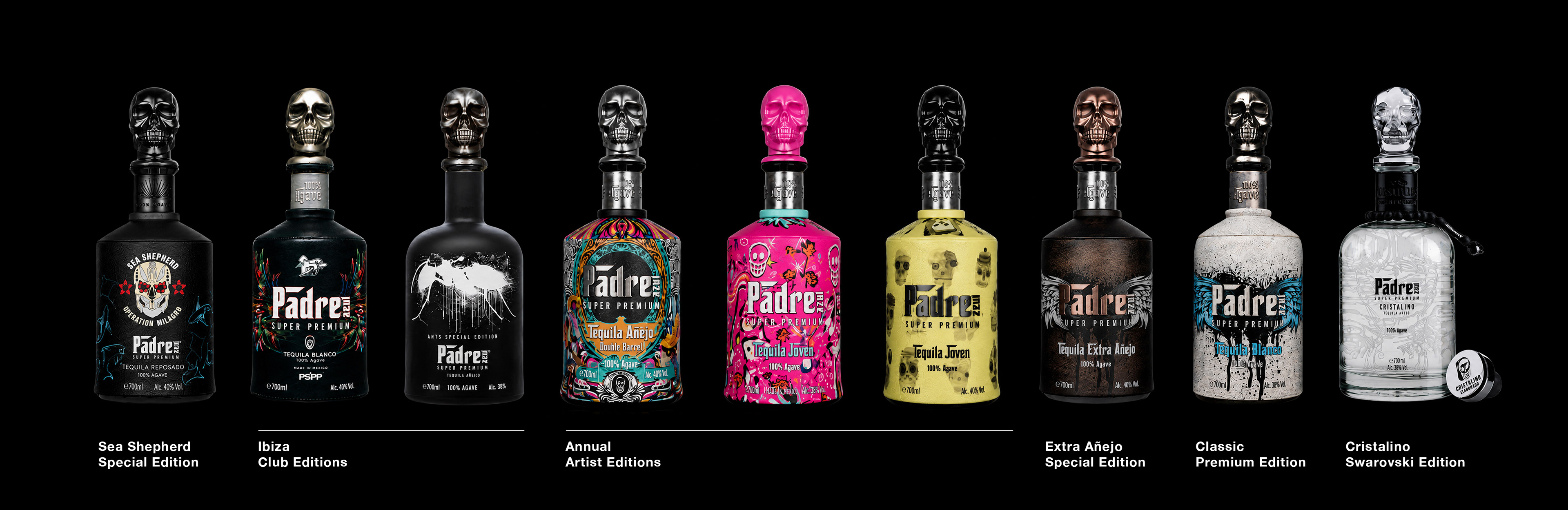
The most memorable things aren't perfect — they're special.
Every bottle is handmade. Every edition is unique. Instead of hiding imperfections, we celebrated them—turning authenticity into the brand’s greatest strength.

Making Of
Real people, real photos, hand-drawn with pen, brush, and spray paint.
No AI whatsoever.




CLIENT
PADRE AZUL
PADRE AZUL
OUR WORK
BRAND STRATEGY
CREATIVE DIRECTION
CREATIVE DIRECTION
ART DIRECTION
ILLUSTRATION
PHOTOGRAPHY
MOTION DESIGN